Cover and Art for A Question of Allegiance

The editor has yet to return my manuscript (it’s not due back for another week or three). In the meantime, it’s back to figuring out how to create the cover for A Question of Allegiance (AQoA for short).

I messed up. When creating the cover for A Day at the Zoo, I envisioned something with elements of the novel itself. What I came up with was, in my very humble opinion, great. But great as a cover for the entire series, not for a single novel. Check out the rejected versions here. So what to do with AQoA? Change the color? Add images that weren’t in the original?

When creating covers for a series, there needs to be a tie-in for the books, so on the (nowadays virtual) shelf there’s a sense of cohesion. To generate a reader’s thought along the lines of, “Oh, right, I read that book. These others must be from the same series.”

Some covers use the same fonts and titling for the author name, like S.A. Corey’s Expanse Series:

Click to see in Barnes & Noble

Other series covers keep the layout consistent, even if fonts and backgrounds change:

Click to see in Barnes & Noble

These folks have great cover designers, and access to cool original art. For example, the Mercy Thompson series:

I’m total fanboy of her books. Click to check in out in B&N’s site.

That last one is interesting. The font, after book #3, changes, and the layout for books four and up in the series all use the same font and layout. I can’t say I’ll have access to the amazing artists who painted the pictures used in the book covers, but the artist who put the cover (and book design) together for me did a smash-up job, so I Will Have Faith.
Cover Reveal

The cover’s done. It was an interesting evolution. If you’re looking for plot or characters, this isn’t the post for you. It hopefully shows the evolution of a cover from simplistic ideas to a finished, professional product.

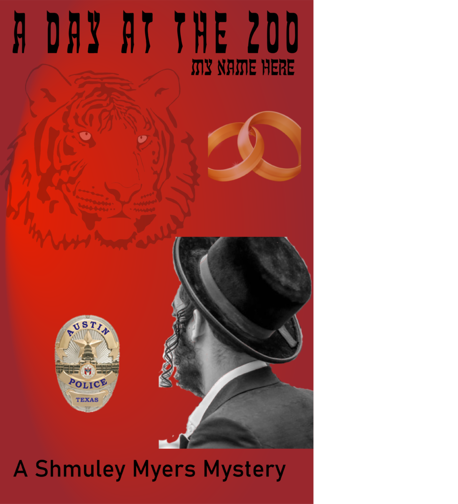
I learned a lot, most importantly that while I’ve got some very small graphics skills, and initially was going to create my own, there’s nothing like having a professional. Here was my first swag, a mishmash of visual ideas, just to generate ideas.

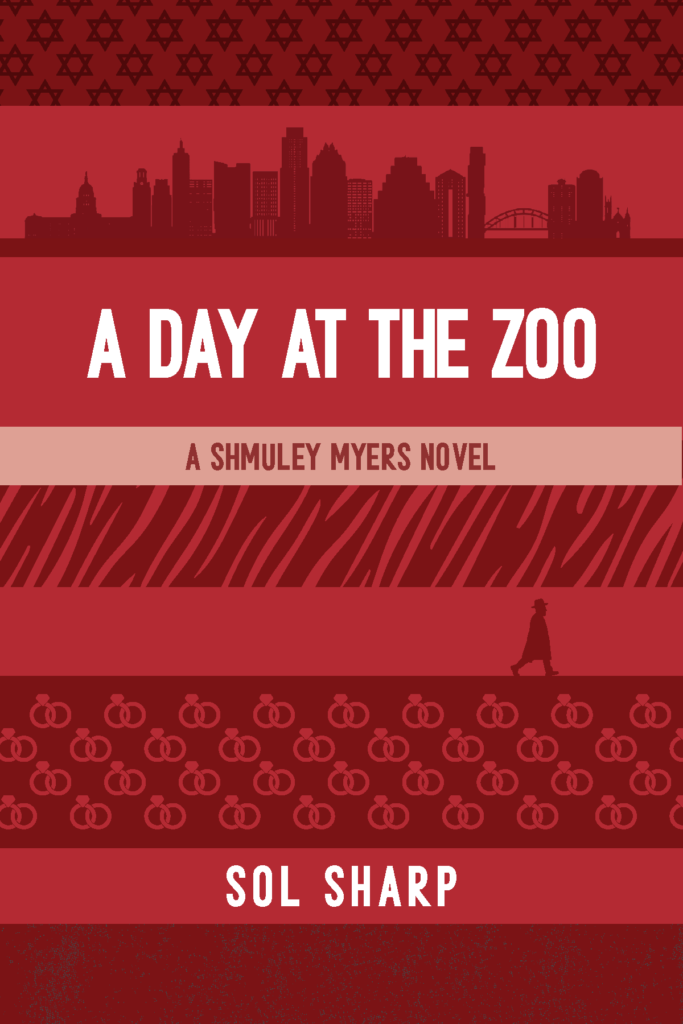
Many collective groans came of this (folks, it was not supposed to be a real cover!), so I signed Gudrun up to make sense of this, and she came up with a few thoughts based on it:

For a European artist to do the research on creating an Austin skyline impressed the heck out of me. More on that later. While the badge shape with the Start of David was more on the nose than Gudrun realized, it was too prominent. Also, the tiger’s important, but only at the beginning of this crazy romp.

Busy, Great colors, nice background of Austin (still) and good font set. Shmuley was still too frum (religious)-looking, and I was concerned about using an actual person’s face.

Even busiererer. Pumped up the married part (he is, it’s important, but…just no, for the cover). I did like the walking man. Progress, moving forward… Time for another round.

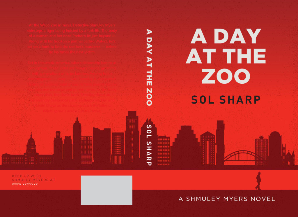
It had a lot of things I wanted, except Shmuley’s hats & coat weren’t accurate to his religious affiliation. We closed on the fonts. Then we looked at the entire jacket:


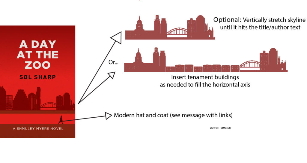
I wanted the spine to be clearer, but, more importantly, this novel takes place in an alternate history, so I needed to remove the newer buildings, and add a chunk of tenements. So I sent off this:

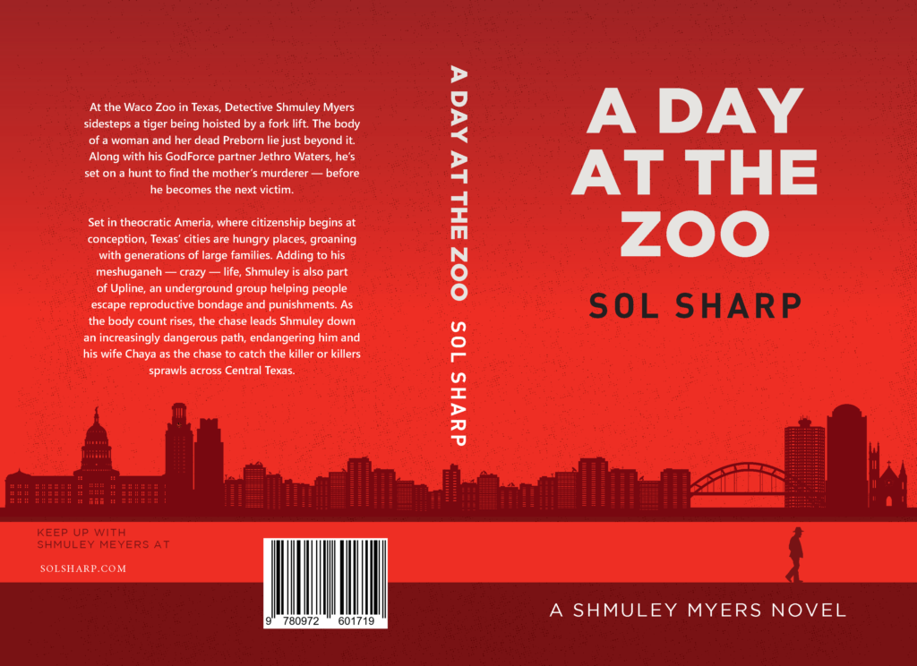
Gudrun’s freaking magical:

So here we are: a cover that’ll not just be good for A Day at the Zoo, but be the basis for follow-on books in the series.