Michael Chambon and Orthodox Judaism

Austin Poet John Gibbons posted this NYTimes article about Orthodox Jews and an extension of an eruv, which lets Jews carry (anything other than clothes) on Shabbat between private (their house) and public (everywhere else) spaces.

Reminds me of my friends when I was growing up with keys made into tie clips or embedded in simple necklaces. My synagogue even had a red/green traffic signal visible so people could pass by and see if the eruv was unbroken (another tease to read the article).

John also reminded me of why I got into the Shmuley Myers series in the first place. I really loved The Yiddish Policemen’s Union, which Chambon wrote in 2008. Where his book focused on the grander scale of the American Jewish community at an inflection point (no spoilers, go read the book!), I wanted something more intimate, where the Jewish component was as much a fabric of life as that of a homicide detective. And where he has Alaska as the focal point, much as Gene Roddenberry used Star Trek as a stage for human problems, I wanted something more tactile, more interacting with the physical space that Austin provides in spades. Hat tip to Michael for writing this book, and (shameless plug) check out my books in the Shmuley Myers series!

Limits of Privacy and Intrusion

The consequences of deciding what people can do with their bodies are just starting to cascade The slippery slope of how intrusive the state governments will be is just starting to reveal itself. spoiler alert: the slope turns into a vertical wall fairly quickly.

Looks like A Question of Allegiance will be released towards the end of the year. subscribe to the mailing list for a very few emails a month.

/

Cover and Art for A Question of Allegiance

The editor has yet to return my manuscript (it’s not due back for another week or three). In the meantime, it’s back to figuring out how to create the cover for A Question of Allegiance (AQoA for short).

I messed up. When creating the cover for A Day at the Zoo, I envisioned something with elements of the novel itself. What I came up with was, in my very humble opinion, great. But great as a cover for the entire series, not for a single novel. Check out the rejected versions here. So what to do with AQoA? Change the color? Add images that weren’t in the original?

When creating covers for a series, there needs to be a tie-in for the books, so on the (nowadays virtual) shelf there’s a sense of cohesion. To generate a reader’s thought along the lines of, “Oh, right, I read that book. These others must be from the same series.”

Some covers use the same fonts and titling for the author name, like S.A. Corey’s Expanse Series:

Click to see in Barnes & Noble

Other series covers keep the layout consistent, even if fonts and backgrounds change:

Click to see in Barnes & Noble

These folks have great cover designers, and access to cool original art. For example, the Mercy Thompson series:

I’m total fanboy of her books. Click to check in out in B&N’s site.

That last one is interesting. The font, after book #3, changes, and the layout for books four and up in the series all use the same font and layout. I can’t say I’ll have access to the amazing artists who painted the pictures used in the book covers, but the artist who put the cover (and book design) together for me did a smash-up job, so I Will Have Faith.

Release, oh sweet (pre-)release! [edited]

While I’m currently wrestling on getting the paperback edition up, the kindle version is available for pre-order on Amazon. It’ll be on KDP for the first 90 days at least. Gudrun did a great job on the inside — much slicker than I’d expected, and I did have expectations, thankyouverymuch.

The aforementioned paperback grappling was, as much of this journey has been, an education. ISBN’s I have, and a different one is necessary for each medium in which the book is produced (e.g., ebook, paperback, hardcover, audiobook, CD). ISBNs aren’t required for Amazon’s platform, but are for other ebook venues. For print, however, ISBNs are required and, if the author is supplying them, an “imprint” is required. ISBNs are connected to imprints (e.g., Orb Books, an imprint of Tor Books, the publisher).

Not sure about hardcovers, although current wisdom is that the more media a book appears in, the better the sales, at least on the Amazon platform. I’ll burn that bridge once I get the ebook and paperback out.

BE003721.jpg

I’ve also started looking into an audiobook version, and trying to decide on whether to look at single-reader vs. ensemble of characters. Also on how I’d pay said reader or readers. So, mulling it over while marketing, editing, and, oh, right, more writing.

On the marketing side, I’m looking into reviewer sites, many of which require the book to be published. A catch 22 for a first novel under this name

Getting a mailing list put together. Writing these posts. Having a day job. It’s a lot to put into a blender. But don’t worry… just pre-order the book and your troubles will be solved!

Publishing, and no book’s a single person’s work

I’ve decided on a “soft launch” for A Day at the Zoo, now that copyediting and cover and pagesetting are done. Kindle electronic (probably not KDP) and paperback to start with. I’ve been reading up on publishing from a few sites, including ALLI, which I recommend for anyone serious about Indie publishing.

One of the last things I did to button up the book was to list the people that helped. It turned into all manner of folks. I like a well-researched book, that tracks, as closely as possible, science and reality. That included a few groups:

Writing groups. Austin is blessed with a very active writer population. The venerable SlugTribe group meets twice monthly, open to all, for SF/FF/Horror writing. I’ve been a member almost since I moved here to Austin the early 90s. There’s a monthly bar meetup, which is virtual for the pandemic. I’m a member of the White Gold Wielders writing group, with a raft of former and current game industry folks.

Professionals. I’ve got a cousin who’s an ER doc. Good to have professional advice on exactly how wounds damage and heal. This is a police-based murder/mystery, so having a cop on the virtual payroll is totally necessary.

Experts. Although I was raised a religious Jew, it’s been a while, and Shmuley, the protagonist, is much deeper in than I was. A number of friends served to keep me as honest as they could.

At day’s end, of course, this is fiction, and liberties were taken when I thought necessary. Hopefully I won’t hear their teeth-grinding as they find the places where I’ve skewed from their sage advice.

Next post will have release date and ordering info…

Closing in on Launch!

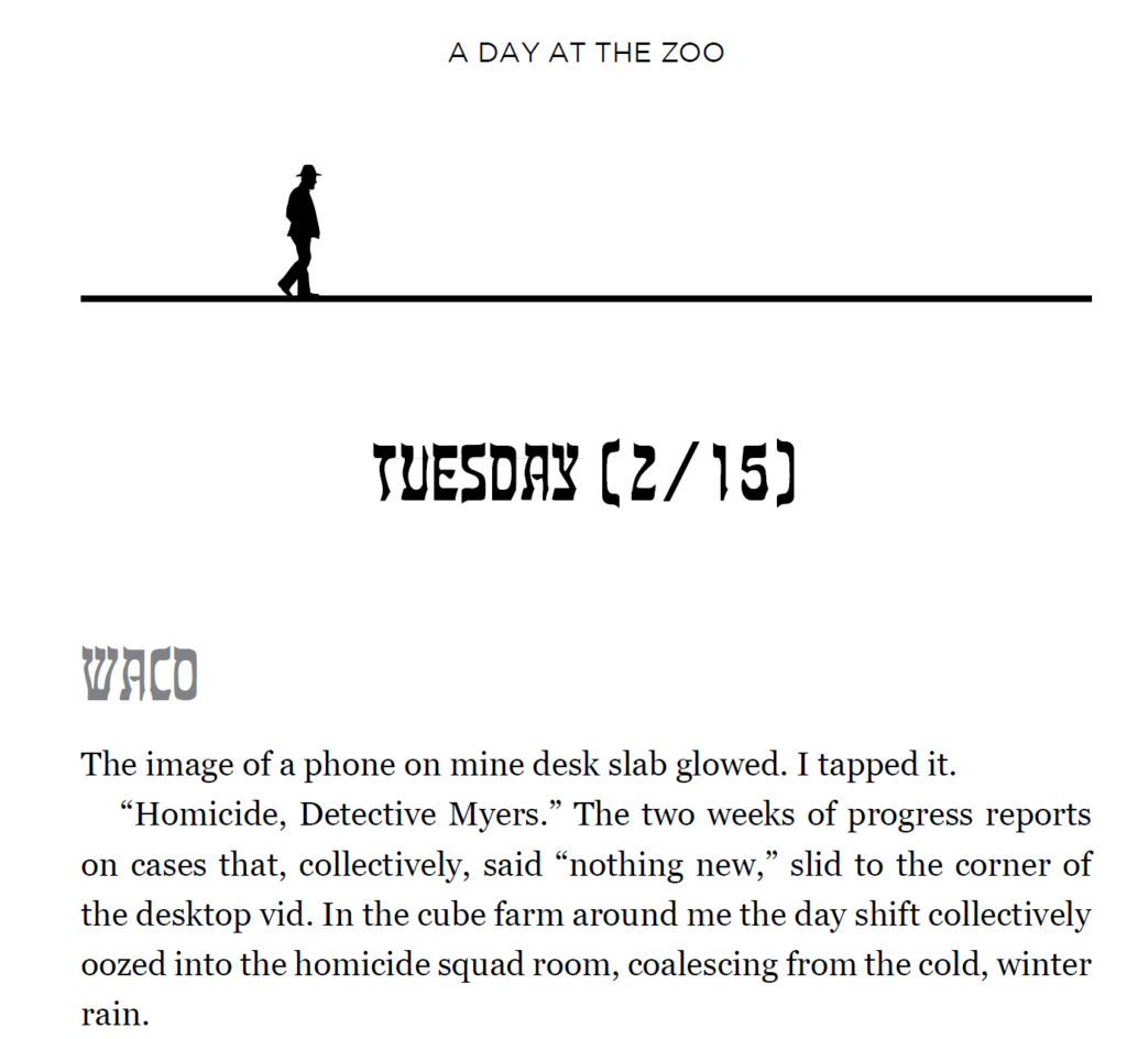
Pagesetting is complete. Gudrun, who did the book’s cover, did the internal layout as well. ; here’s a sample from the beginning of the book:

Sample text from novel.

The walking man icon is taken from the cover, and appears at the top of each chapter. I’m a bit worried about the Hebrew-esque font for chapter and scene headings, but I’ve been assured that it’s perfectly readable by those who don’t know the language.

Cover Reveal

The cover’s done. It was an interesting evolution. If you’re looking for plot or characters, this isn’t the post for you. It hopefully shows the evolution of a cover from simplistic ideas to a finished, professional product.

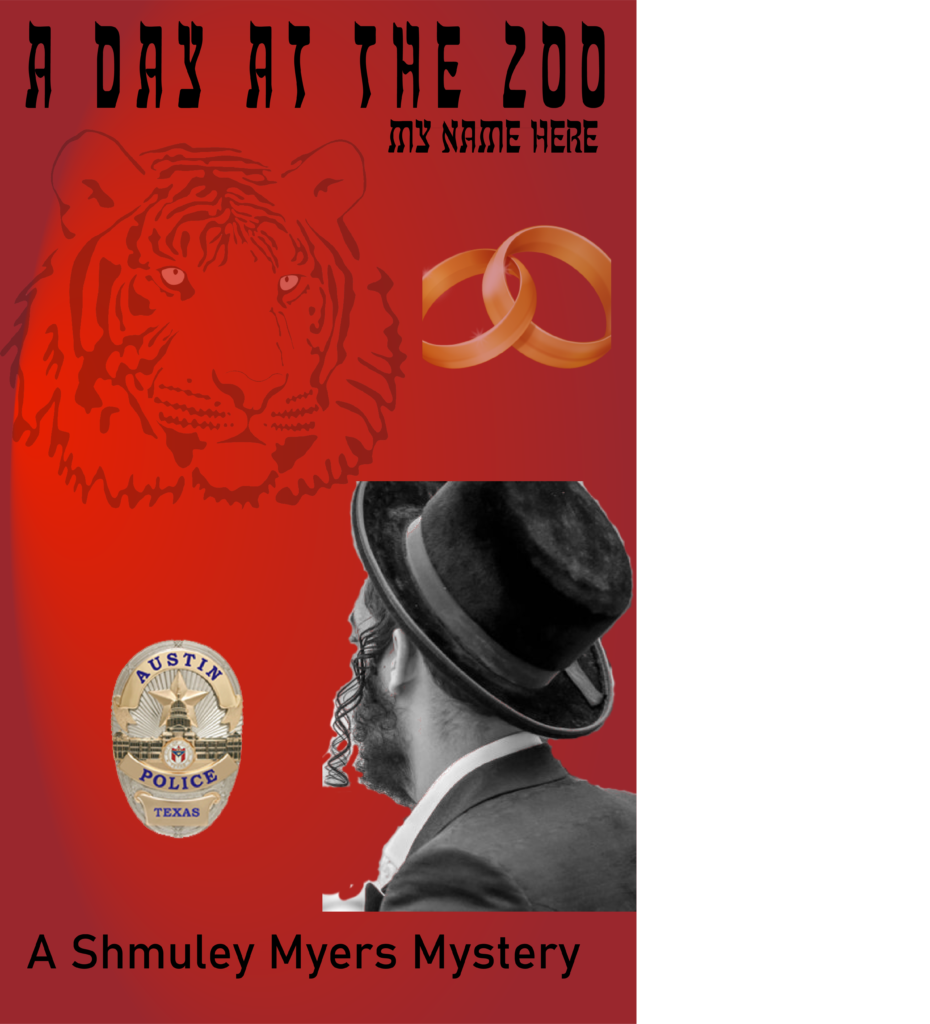
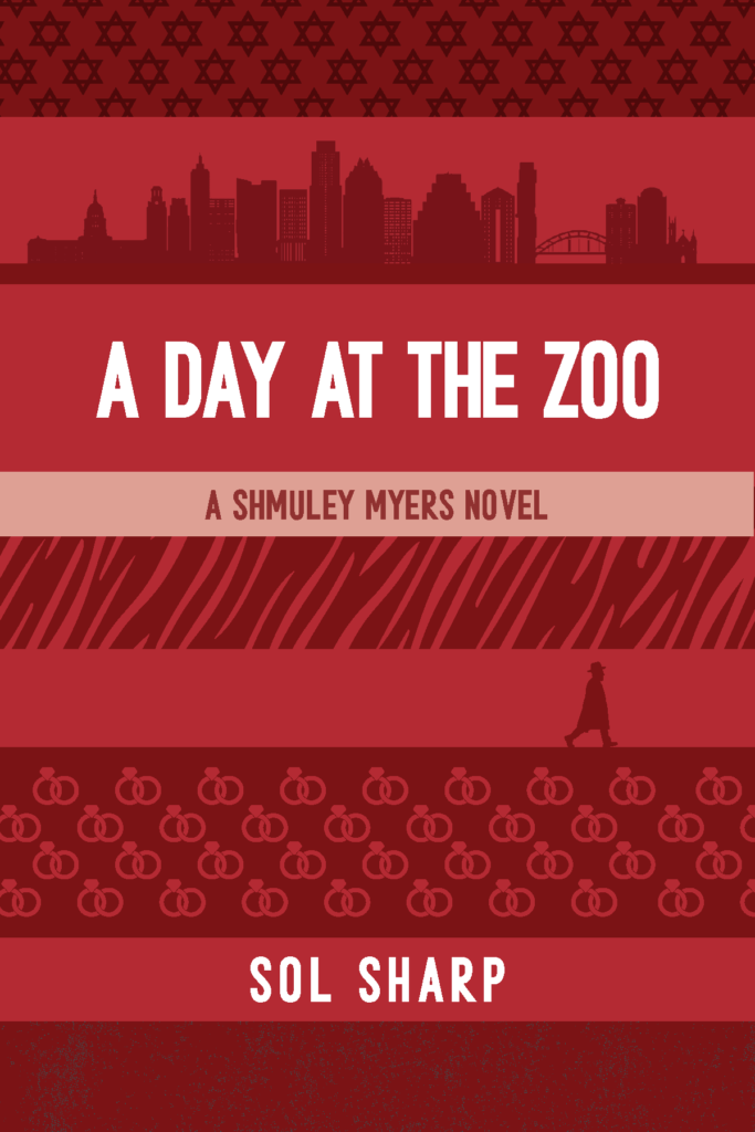
I learned a lot, most importantly that while I’ve got some very small graphics skills, and initially was going to create my own, there’s nothing like having a professional. Here was my first swag, a mishmash of visual ideas, just to generate ideas.

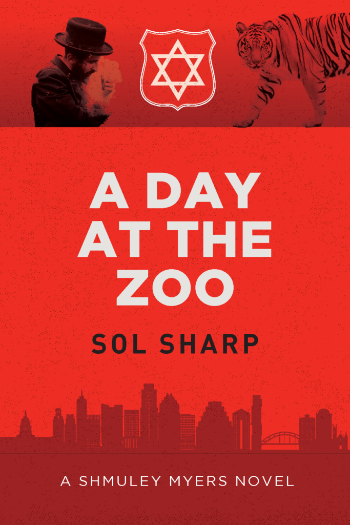
Many collective groans came of this (folks, it was not supposed to be a real cover!), so I signed Gudrun up to make sense of this, and she came up with a few thoughts based on it:

For a European artist to do the research on creating an Austin skyline impressed the heck out of me. More on that later. While the badge shape with the Start of David was more on the nose than Gudrun realized, it was too prominent. Also, the tiger’s important, but only at the beginning of this crazy romp.

Busy, Great colors, nice background of Austin (still) and good font set. Shmuley was still too frum (religious)-looking, and I was concerned about using an actual person’s face.

Even busiererer. Pumped up the married part (he is, it’s important, but…just no, for the cover). I did like the walking man. Progress, moving forward… Time for another round.

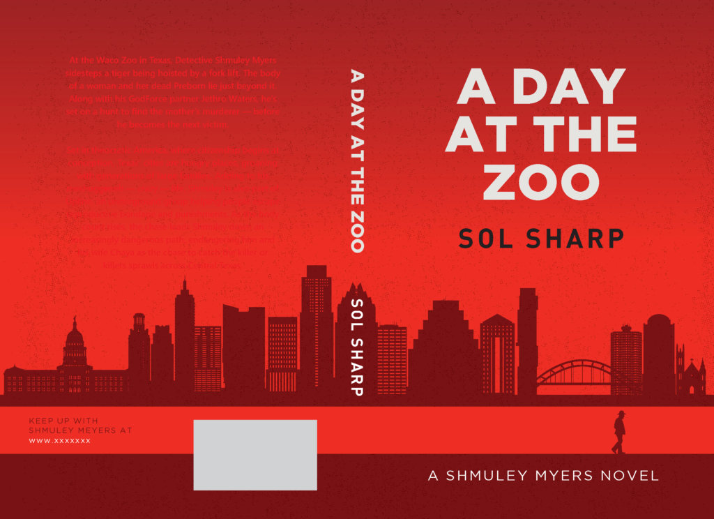
It had a lot of things I wanted, except Shmuley’s hats & coat weren’t accurate to his religious affiliation. We closed on the fonts. Then we looked at the entire jacket:


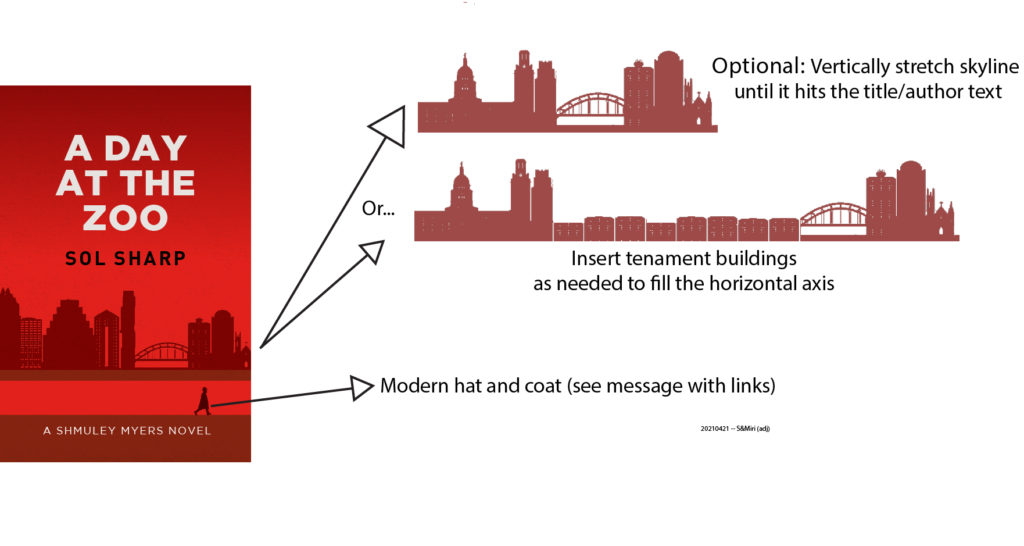
I wanted the spine to be clearer, but, more importantly, this novel takes place in an alternate history, so I needed to remove the newer buildings, and add a chunk of tenements. So I sent off this:

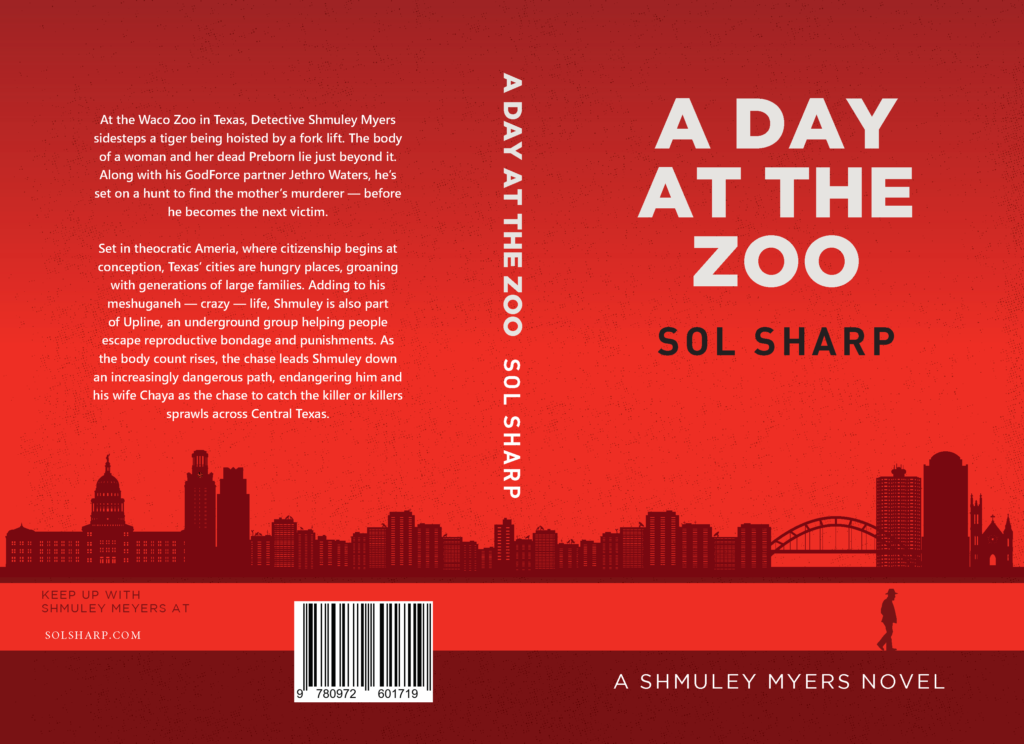
Gudrun’s freaking magical:

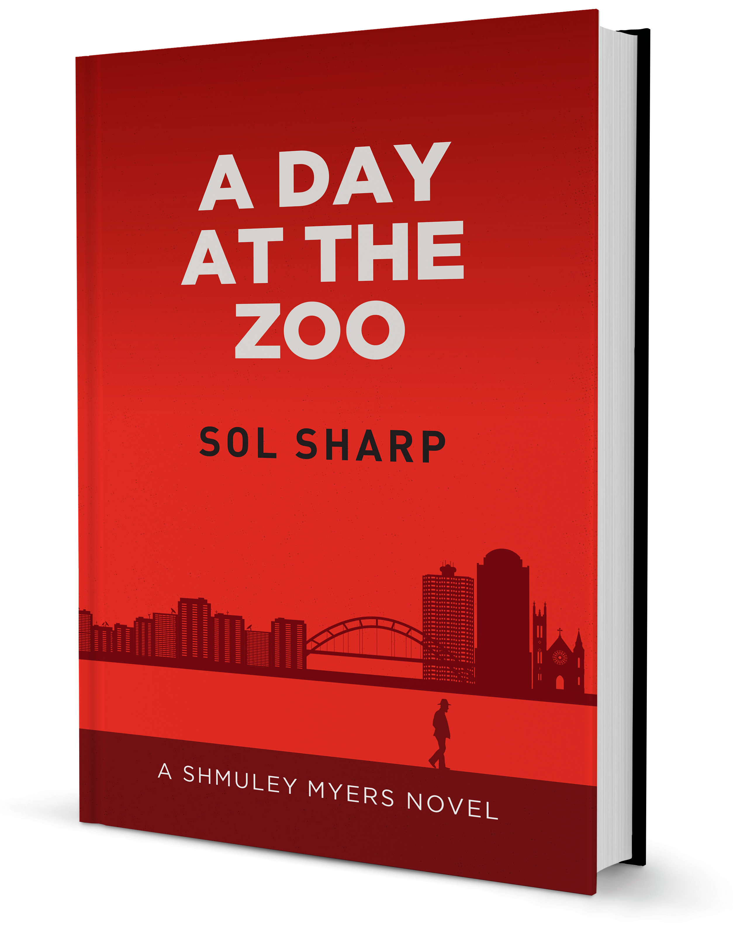
So here we are: a cover that’ll not just be good for A Day at the Zoo, but be the basis for follow-on books in the series.

Oh, the joys of copyediting

A Day at the Zoo is a thriller, with the added fillip of having a narrator who in inside-out English speaks because any which way you can make a sentence in Yiddish.

Initial versions were so densely twisted that it impacted its readability for some early readers. I made edits, then more edits. And, finally, realized that I needed professional help (aside from the psychological variety). I engaged with Robin, an editor in England, to give the manuscript a crisp shaking out and cleaning.

Robin’s not Jewish, nor someone who’s familiar with, as my readers call it, Shmuley-speak. But he read a snippet, and took it on anyway. The joy of a good editor is how they do when presented with strange words and contexts. Here’s a bit from an email from him:

The word shabbes appears regularly with that spelling, in italics, and not capitalised. (Sometimes it has a capital, but I’m tempted to retain the lower case because that seems to be the majority default rendering.) What, then, is Shabbat, which presumably means the same thing, but has a different ending and a capital? I can’t imagine it’s all that difference as a concept, but what would you prefer? Leave the discrepancy aziz, or render Jewish sabbath and Shabbat consistently as shabbes? (Such things get noticed – Chapter 2/19 is actually called Shabbat, but the first word in the text is Shabbes.

Elsewhere I am trying to make sensible decisions as to what to capitalise and what, not. Generally, if a word is familiar enough to Western ears I leave it in roman (eg bar mitzvah). If it is less part of the mainstream, I retain the foreignness in italics (eg, goyim). BTW, I thoroughly agree with your practice of immediately providing a translation of each new term as it occurs. Our narrator is steeped in his own culture and history, but he doesn’t want to estrange anyone. This is a neat and economical way of indicating that character trait.

Meanwhile the intrigue continues. Who would want to poison a tiger? And why was this particular woman the victim? And what a dangerous game Shmuley is playing with the fugitives. There’s a lot going on and it’s all moving forwards nicely. But do let me know about the shabbes thing.

So… fun times for me. I had final say, and it was quite the process going through all the nits as well as the larger issues. Authors editing their own manuscripts only gets someone so far. Robin’s been awesome, and hopefully he’ll be able to take on the coming manuscripts from the series.